

Kapindo concept Design v1.1
- Mar 25, 2022
- 1 min read
Updated: Mar 26, 2022
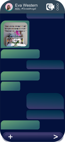
So here is our first concept UI Design. Dark theme, simple interface (we hope so) and a few examples.

About #positioning, #shapes and #colours
Kapindo researchers found out that many people prefer seeing information positioned in the centre, rather than on the right or even left. We were thinking how could we implement it and decided to swipe each side menu as close as possible to the centre, also keeping in mind app's look and convenience.
In our second research we found out that there are many people who prefer round corners rather than square ones in the app. We will keep this in mind when creating Kapindo BETA. After release we will also give you an opportunity to change whatever you want, as promised.
In our little pre-research we found out that there are apps that use colours that could show their product, intentions etc. Kapindo is a world-connecting app so we chose a photo of our planet Earth as a reference!


Waiting for your comments and opinion!
Want to share your concept UI & UIX design, Stickers, emotes or share any relative design content? - Feel free to write us an email (hipallzone.hz@gmial.com). Following the form below.
Form:
⚠ Topic: Concept Design for Kapindo
1. Introduce yourself
2. Describe your concept
3. Attach files (photos .png, .jpeg; videos .mp4/links)
4. Send us your concept and we'll post it for discussion.
IMPORTANT!
Emails without exact topic won't be accepted
Comments